
Xbox Live status
Xbox.com
Users come to this page in moments of crisis; Netflix is down, they’re late to join the raid because their console cannot connect, that demo that just released won’t download.
This page lets users quickly check the status of their app or service, serving as a starting point to troubleshoot issues. Users need to quickly scan the page, determine if the issue is because a service is down, and help connect them to information to solve the problem. If a service is down users can stay in the loop with text updates, if it is running we can connect them to articles that might be the cause of their troubles.
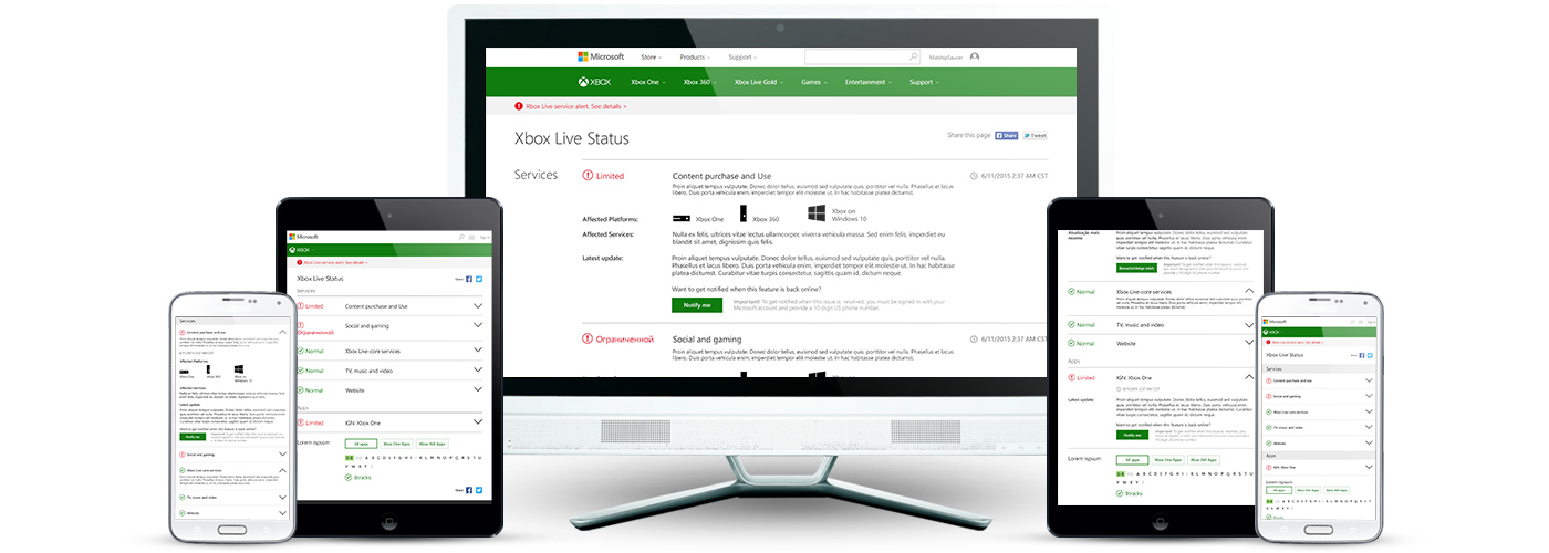
The page was updated to a responsive template, so that users can access the same information from any device. Additional optimizations were made to make the page more readable and easier to use. These optimizations are detailed below.

Old design

New design
Item details
Old: The existing design for this page was difficult to read, the gap between section title and content was too large and the lines really broke up the content. Additionally, the primary CTA was hidden in the content as a hyperlink that didn't have interaction states.
New: To increase readability I extended the text line lengths and got rid of the lines separating content, and created visual hierarchy with text styles. Also, I changed the Notify Me CTA to a button, increasing visibility and ultimately reducing calls to support.

App status list
Old: The toggle buttons here pulled a lot of visual focus to this area of the page because they were so heavy, they also didn't appear to be interactive. By default, the page loaded the full list of apps, making the page quite long and consuming additional data on mobile devices. Finally, the hyperlink styling doesn't clearly indicate that the titles are interactive links.
New: The toggle buttons were updated to be lighter and pull less focus. All apps is clearly selected, and the hover states indicate that these are interactive elements.The list of apps and length of the page was reduced by having the first letter pre-selected.

Old design

New design

Mobile
In smaller screens the status indicator is reduced to a simple icon, showing an item is either normal or limited with icon and color. This allows us to reduce the vertical height, fitting more items on the page to allow for a more inclusive "at-a-glance" view.
Each item expands to reveal more detail, normal items revealing the item description and limited items revealing the details of the outage.
The apps list toggle becomes a dropdown selection on the smallest screens.