
Sticky CTA
MicrosoftStore.com
Problem: Microsoft Store product detail pages can be quite long, and if a customer scrolls to the bottom, they have to scroll back to the top to select a variation and add the product to their cart. M
Solution: Making the price, variation selector and Add to cart button sticky, as part of the sticky nav, allows cusotmers to select a variation and add to cart without scrolling back to the top of the page.
Testing: Quantitative, multivariate | Results: Increased conversion | Status: Launched


Explorations
Explorations tested the elements that should carry over from the buybox area into the sticky CTA.
This phase considered what information was relevant and which information could provide the extra nudge to buy in this limited space.
It was determined that the price and the savings message added the most value to this space.
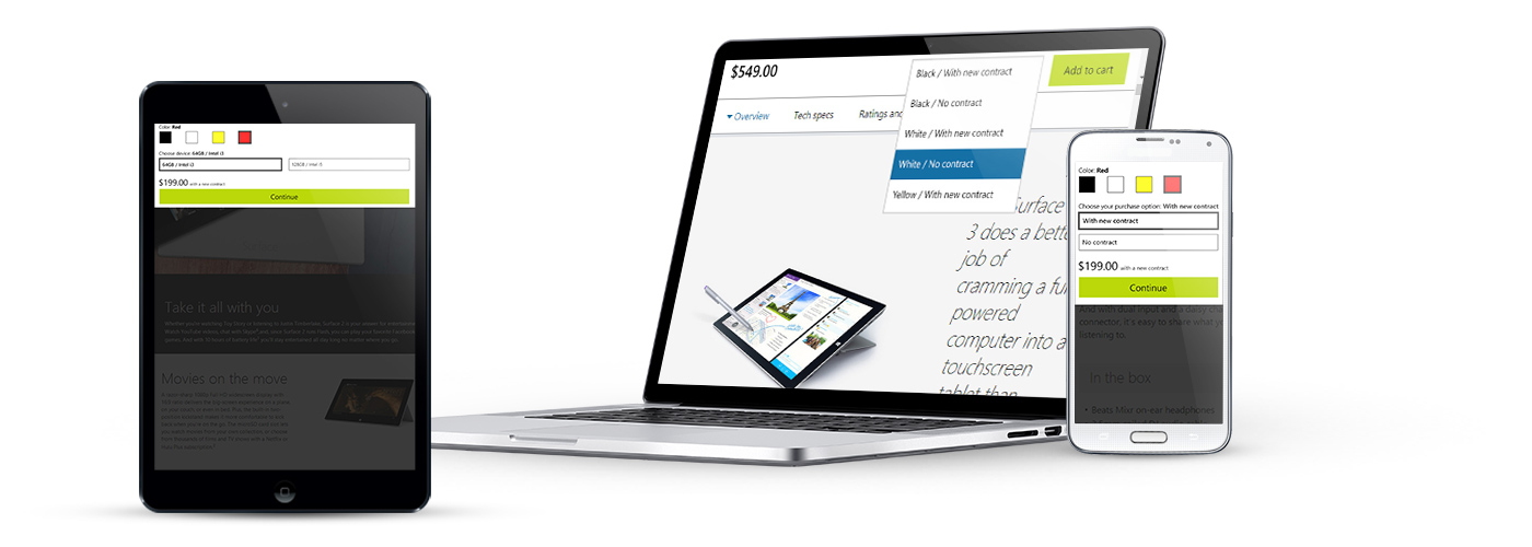
Desktop

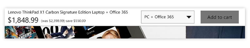
The sticky CTA includes the pricing and discount information, reducing the need to return to the top of the page to double check important information, also keeping a savings message within view throughout the page.
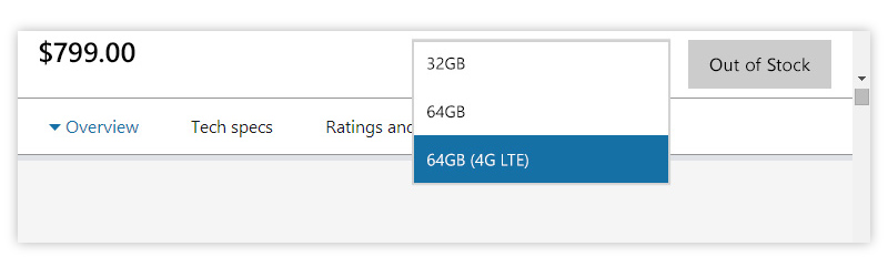
The dropdown allows a user to select from product variations. The price and savings message is updated when a new variation is selected.

Tablet
In tablet the Add to Cart button stretches the width of the screen and sticks to the top. This view reveals the variation selection and prices after interaction, to reducing the screen percentage of screen it consumes.

Single variation
Upon activation the customer selects a product variation from group of toggle buttons.

Double variation
Upon activation the customer selects from two different sets of variables.
Mobile

Rest

Single variation

Double variation