
MyLodgeTax buy funnel
avalara.com/lodgingtax
Part of the effort to reduce cart abandonment and increase sales, this project focuses on restructuring the purchase funnel. This project increased new customer conversions from 19.3% to 38.8%.
Assessing the funnel
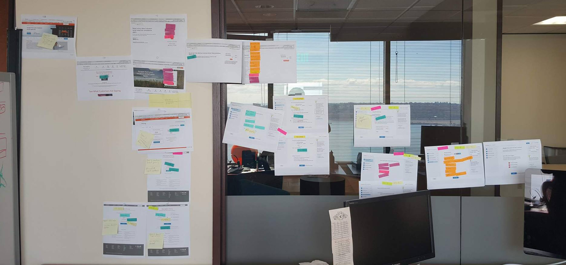
Accounting for both users who were familiar with the MyLodgeTax product as well as users who were still learning/ browsing, I explored the users journey through existing funnel, as well as the funnel proposed by the business group. Then I assessed how information was distributed through the funnel (teal/blue - product info, purple - create an account, orange - payment, pink - legal). With all this information, as well as my previous learnings from MyLodgeTax pricing studies, I determined the key pitfalls in the existing/proposed purchase funnel.
- Customer is required to create an account prior to understanding cost or committing to purchase
- Customer is not sure of immediate cost, or continual cost
- Customer is unsure of how long the checkout process is, or what information is required
- Customers are unsure how to purchase the product for multiple properties
Try it as a conversation
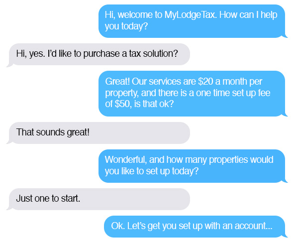
In online experiences it's very tempting to slip in an extra business goal or get steps ordered in a way that would never occur during a person to person interaction. It's these details that change a users enthusiasm or desire to engage. My favorite way to humanize an experience is to explore the interaction as a conversation. Watch this Google video for an example >
A conversation between a customer purchasing MyLodgeTax and an employee forms the structure of what will later become the stages of the funnel.
Wireframing / Stakeholder input / Iteration


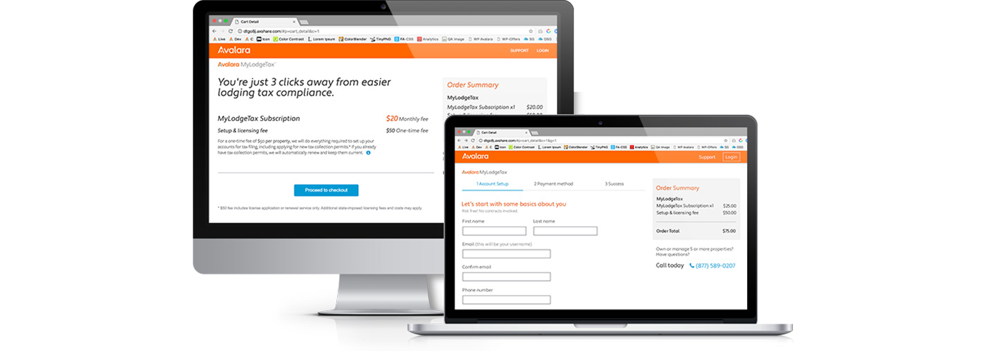
MyLodgeTax cart
Usability testing
Based on previous data and stakeholder input, I proposed a new flow that:
- Introduced a "cart" prior to user account setup, giving users more information specific to their purchase prior to requiring them to commit to a purchase/account
- Introduced a persistent "order summary" in the right hand column, as well as modified language in the cart providing additional description of fees
- Grouped data into understandable categories such as account setup and payment method, and removed user inputs that were not required for purchase into a secondary flow called "account setup". This shortened the time and information required from the user for purchase and make it more predictable to the user.
- Introduced a "number of properties" dropdown in the cart
Using the goals determined by our business, I collaborated with our analytics team, who developed a script and set up a test to run against my prototype.
IMPLEMENTATIOn
Based on the success of the user test, I made my final proposal to the MyLodgeTax team. With some negotiating, we were able to move this project into development with only the loss of the "number of properties" feature. Since the launch, conversion has increased to 39.3%.

Cart
Clear product and pricing descriptions prior to purchase commitment.

Account setup
Concise, coherent, organized
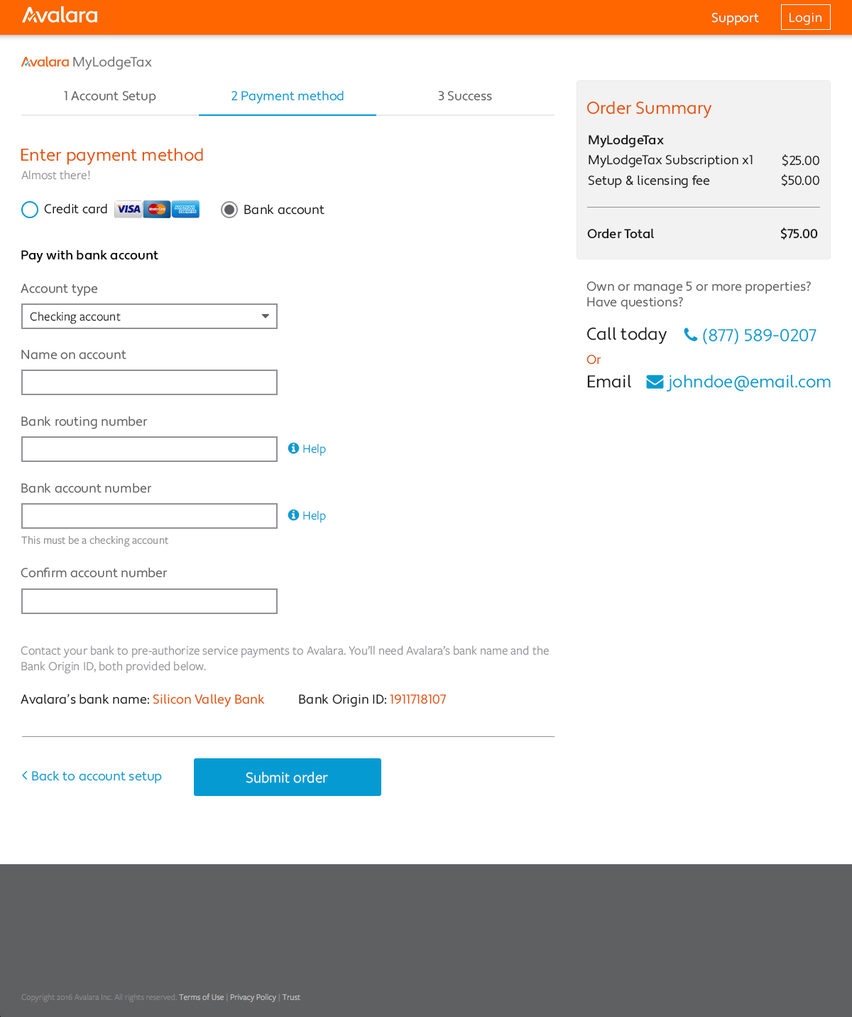
Payment method
Options for band or card, clear form labeling

Thank you
User information, clear direction to complete account profile and what steps are required next