
CPB Online & Mobile Banking
central pacific bank platform migration & rebrand
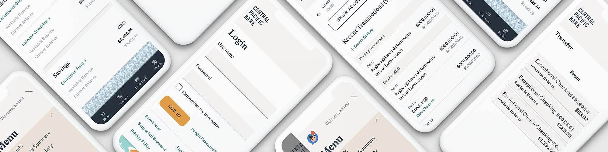
All of your banking - without going to the bank. CPB online & mobile banking makes it easier than ever to manage your finances. On top of the services you’ve come to expect (account history, remote check deposit, biometric login, etc.), check out the cutting-edge tools that give you a clear picture of your entire financial situation. Banking made human.
Project Challenges: Limited control of UI, vendor controlled iFrames, and cross-platform consistency.

Roun
Landing page
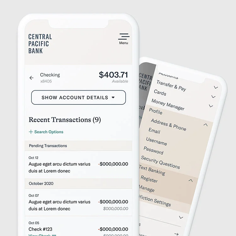
The most common reasons someone logs into their banking app:
Check my balance
Review recent transactions
Make a transfer
Our goal on the landing page was to easily give our customers an overview of their account balances, make it easy to move their funds around, and take action on the most common tasks.
We also introduced an “I want to…” section, which is a call back to the “I want to…” language on the marketing website, and serves to position common tasks as actions to take. In our research, our users preferred this module to the main navigation as a means of getting around.
Our testing also showed that our customers prefer to see their Current Balance too, rather than just the Available balance. This helped us make the decision to show it on the Account Summary screen for both mobile and desktop.
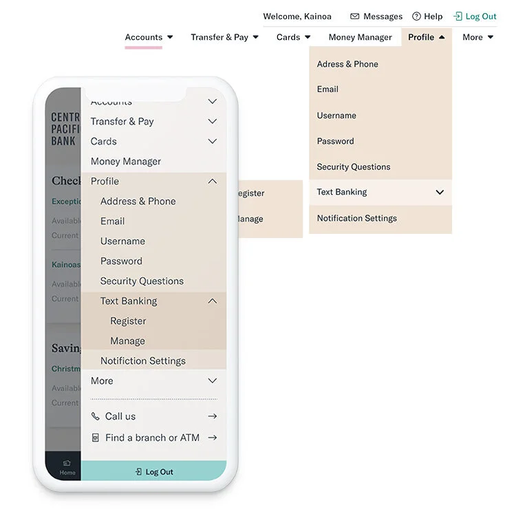
Navigation
The navigation, as in most projects, was top priority. One challenge the existing app had was that it was difficult to know what you would or could find under a nav item. The user would first have to navigate to the section to reveal the secondary navigation level, and even still the secondary navigation would change page to page. Additionally, there were several features that a user would have to know existed in order to find (debit card management & person to person payments).
With the new navigation, we wanted to focus on a few things that would make it easier to get around:
Flatten this navigation, so that a user could go directly to their intended page.
Have navigation items that went directly to feature pages (even if we had to build a special anchor to do it (I’m looking at you Zelle).
Respect the expectations of our current customers.
Use human language, rather than internal-vendor-banking-language.
We started with a survey of sorts, where we sent our intern out onto the mean streets of Honolulu to ask the public what they would call a page, based on the description of what the page did. That rolled in to a card sort, which rolled into our usability testing. Iterate, test, repeat. Once we had the architecture down, we worked with our development team to modify the platform to our branding style, and made a few customizations to do things like make the “Logout” button sticky and our top level items findable on mobile.


login
Our customers desperately needed an ally when it came to our login page. We worked hard to introduce a few key features to the login experience:
Enroll in Digital Banking from a mobile device.
One password, no matter which device you were logging in from.
Access to the Forgot Password flow from a mobile device.
Biometric login that you can find.
Show/Hide Password on mobile.
Visually, these screens are the face of our app, so we wanted to highlight the fun and friendly illustrations that came with our brand.
Initially we’d considered another image for the the mobile app login screen, but our research helped us decide on this wave image. This image is highlighted on both our website homepage and app icon, so it worked out great.
Feature: Print activity
I haven’t had a chance to play around with printed materials a lot in my career, but the opportunity came up with this project. Our customers wanted to be able to print their account activity, mostly for tax purposes.
We upgraded the default output of the print feature to squeeze in a few more transactions and the account info, while balancing readability.