
Live status notification
Xbox.com
Problem: When a service goes down, we want to make the disruption as easy as possible on our users.
Solution: Rather than making our users keep coming back to check our site, this flow allows us to reach out to them with updates they care about. It was important to make this feature seamless, so as not to create any doubt or confusion in a moment where our users might already be frustrated.
Testing: Quantitative, multivariate | Results: Increased conversion | Status: Launched

Rest
The previous CTA was hyperlinked text that didn't stand out against the other text on the page. I made this CTA a button to increase visibility.
Active
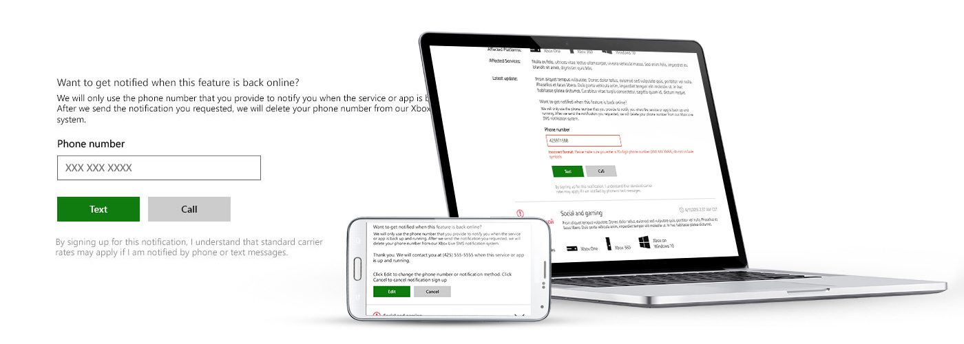
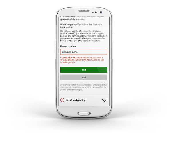
Old: In the previous design, when a user expanded this section of the page, it's unclear whether the service is available or not. The buttons look disabled until the user successfully enters a phone number in the unlabeled box. The design also gives equal weight to both text and call buttons, which are both green when active.
New: The optimized design uses a label and hint text to help the user quickly understand the desired action. This design also assigns a clear primary and secondary call to action. Both users and business prefer the "Text" option, which is supported by the design, easing the processing effort for the user.

Old design

New design

Cancel/confirm
We wanted a way for users to be able to quickly cancel notification requests that wasn't disruptive, but also a way for them to back out if they'd canceled by accident.
I simply added a link back to the signup form to the "thank you" messaging.
Mobile design