

Avalara Homepage
Avalara.com
With an exit rate of 64%, the face of our company was not meeting user expectations to say the least. This project set about to overhaul the homepage of Avalara.com in attempt to lower exit rates by better meeting user needs, and therefore better achieving business goals.
With only half of the proposed changes made, the exit rate on this page has already dropped to 51%.

Round 1
Brainstorm
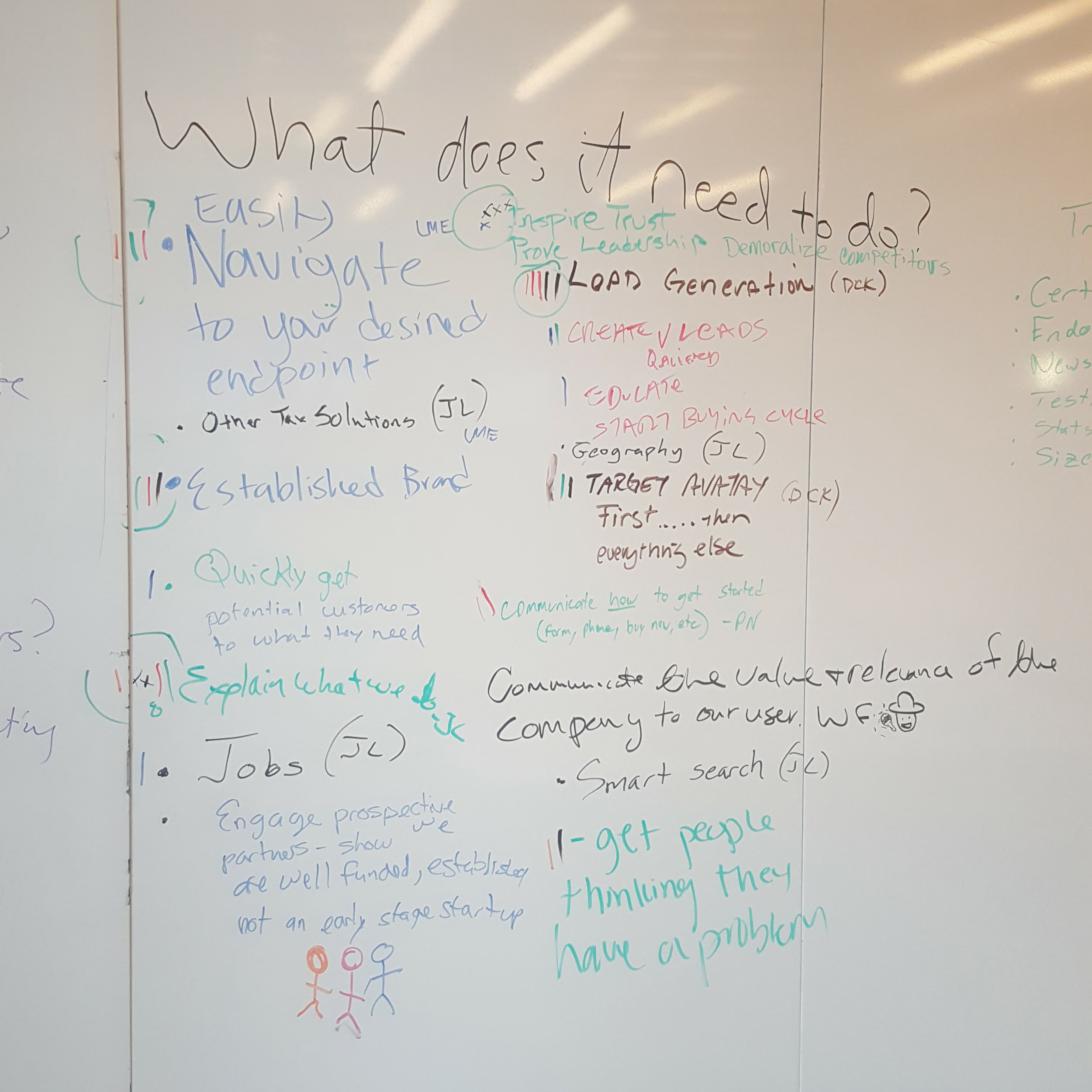
For the first brainstorm we invited employees who worked on or with Avalara.com to come answer the question, "What does the homepage need to do?" Each attendee, from their varying areas of expertise, freely wrote down on the whiteboard what was important for their interests. Next, we took stock of what everyone had written and each attendee ranked the list for the top 10 items.
For round 2, we invited Avalara stakeholders (business units, executives, etc) to brainstorm with us, We asked "What does it need to do?", and added "How does it need to feel?" to separate function from feel. This time we asked attendees to put tick marks next to the 5 most important items to them.
Resulting homepage goals:
- Lead generation
- Explain what we do
- We're global, national, local
- Established brand/ inspire trust
- Easily navigate to desired end point

Qualitative testing
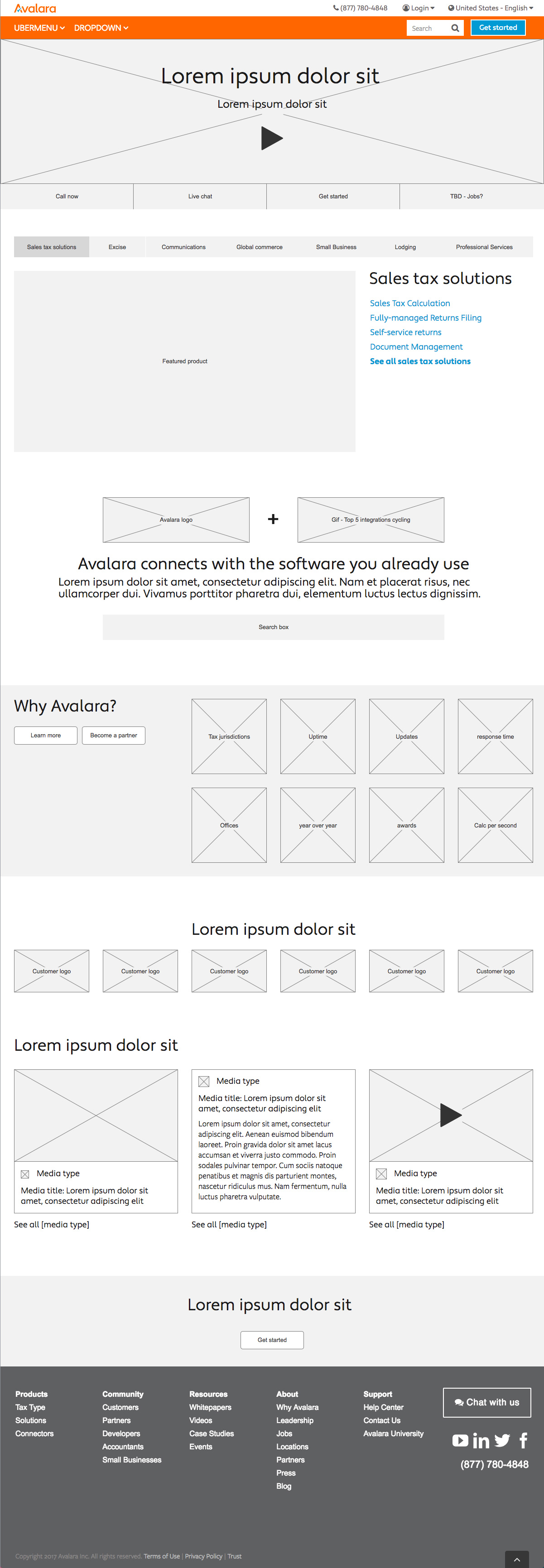
Based on the goals we had come up with, as well as the research I'd done, I began to iterate on wireframes. In my competitive research and research on how a user experiences a homepage, I determined that the most compelling way for our users to experience the homepage would be to block out the information into the sections (right): 1. Communicate sites purpose, 2. facilitate navigation, 3. Communicate info about the company, 4. reveal through examples
I used this structure to inform my wireframes:
The wireframes were reviewed and iterated on internally before being converted into Axure prototypes for use in qualitative testing.
Using the goals determined by our business, I wrote a script of questions that would indirectly invoke answers that would determine whether any of the new designs would meet our goals. This script and the prototypes were then tested with UserTesting.com


Wireframe option 1
Wireframe option 2

quantitative testing
Keeping the more successful components (determined from qualitative testing) we set about to test the new components against existing. We introduced and tested each component individually, to maintain a clear vision of success.
Results were as follows:
Hero: Some of the results in UserTesting.com were really interesting, and helped us adjust our direction to something better suited to user expectations. The biggest strategy shift was in our main call to action. When asked, "If you wanted to contact a sales representative, how would you do that?"
- 0% users who saw only prototype 1 answered the question successfully
- 100% of users who saw only prototype 2 answered the question successfully.
Not only had all the users viewing prototype 2 answered successfully, they showed extreme preference for the "Live chat" and "Call now" options. This lead us to eliminate all other options, and test a "Live chat" vs. our existing "Get started" email form.
The new hero provided a 32% lift in conversion, with 95% statistical significance.
Navigation: In an effort to inform visitors how our software works as well as encourage navigation, the new search integration was tested against the existing. Our main metric of success was lead generation, as to maintain that this did not negatively effect conversion.
During testing, the was no statistically significant difference in conversion, however improved qualitative recognition of our product function and a win for the brand supported our decision to implement this change to the site.
Brand: With the intention to generate trust, authority, and reliability better for our users by using more focused and digestible information about our business while consuming fewer pixels, we tested a simple line of customer logos against what was previously 1000px of information attempting to achieve the same goal. With no negative impact to conversion, this change was a clear win.
Resources: Testing pending