AvaTax hero
avalara.com/products/sales-and-use-tax/avatax-2
This project explored the "above the fold" space of Avalaras flagship product, AvaTax. The main user story sought to add value to this section of the product page by using the space in a more engaging way, as well as move some content higher on the page. It was believed that better management of this space would result in an increase in conversion.
This project resulted in a 22% increase in conversion, with 95% statistical significance
Control
The previous design consumed ~500px of vertical space, but didn't do much with it. During user testing, users indicated that the lifestyle image didn't make much sense. It didn't seem related to the product and it didn't explain anything. Users often sought shots of the actual product. Unfortunately, AvaTax is a background plug-in, and the interface (when present) is different depending on the software it's plugged into.
Exploration
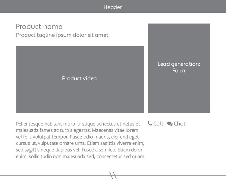
The initial requests to "remove the hero" from the product managers and for "product images" from the users, led to an exploration that made the product video (which used illustration to explain how AvaTax works) the focus of the above the fold content. Users who had watched the video were found to be far more likely to convert. Another focus of this new layout was to make "call" and "chat" options more readily available to potential customers.
quantitative testing
Based on the qualitative results on the exploration designs, we made a few edits to wireframe 3 and then moved it forward for A/B testing against the live site.
The proposed design used a blue wash background that highlighted the lead generation form, paired with an animated graphic that fulfilled the expectation of a visual representation of the product and featured the product video.
Using the successful design from test 1, we tested whether this component would be more successful if the form was on the right or left. There was no statistical significant difference between the two.


